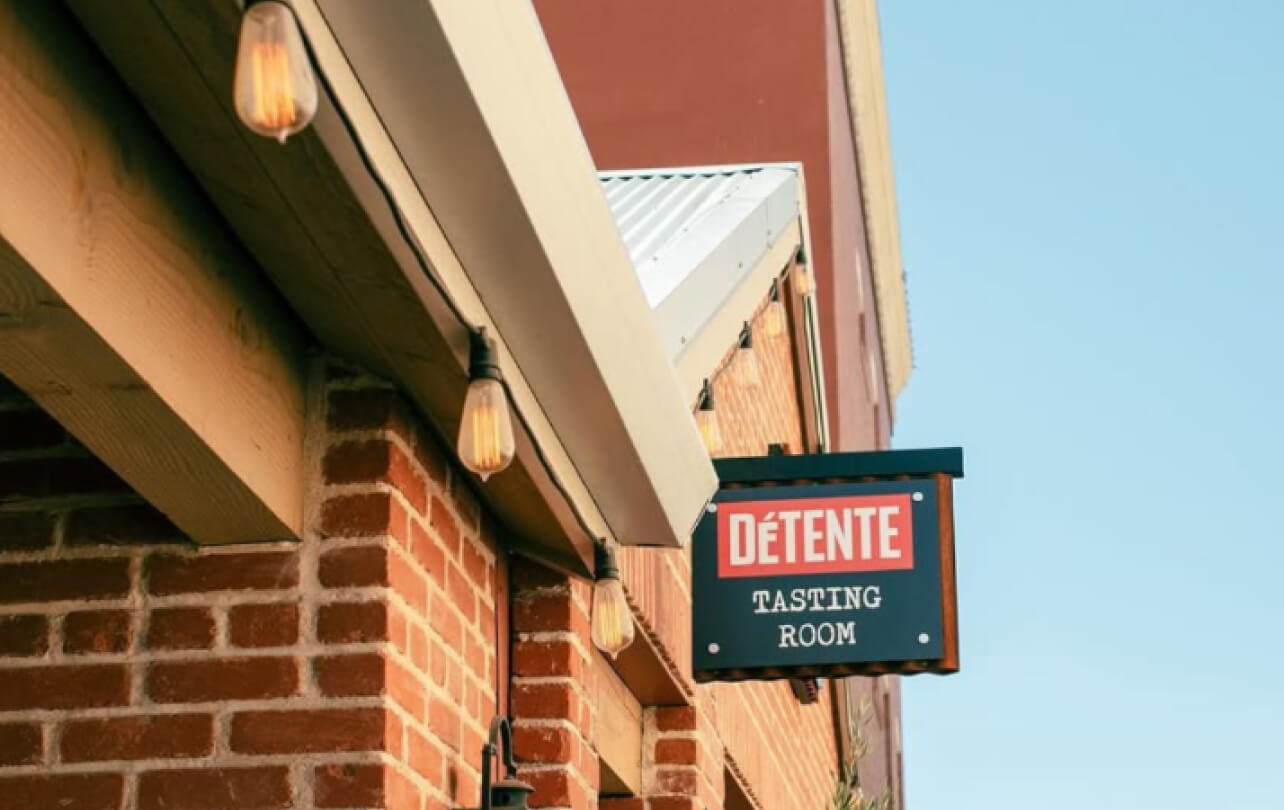
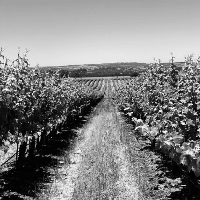
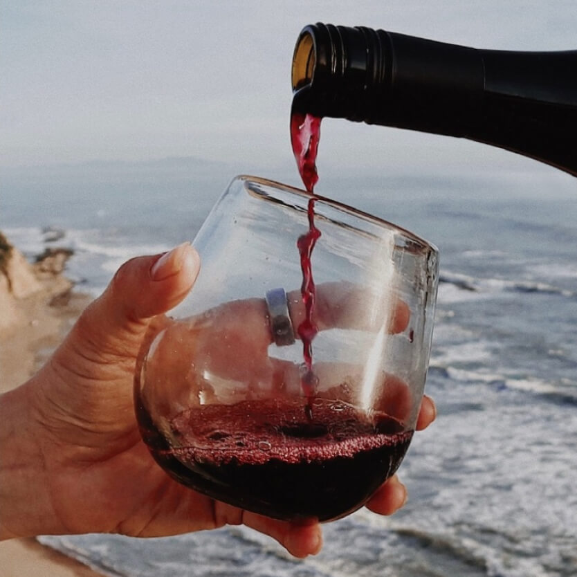
Détente Wines is an established winemaker's secret private label brand. They produce small-lot, classic wines from hand-selected vineyards in Paso Robles. Due to contractual obligations, the winemaker needed to remain anonymous, keeping the brand relatively quiet while still carving out a distinct identity.
What We Did
- Brand Identity
- Strategy
- Package Design
- UX/UI Design
- Social
- Email Marketing

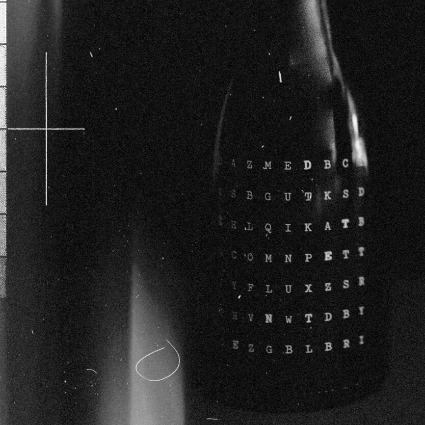
Leaning into Cold War motifs, tension, espionage, and propaganda, to set Détente apart from the traditional wine landscape.
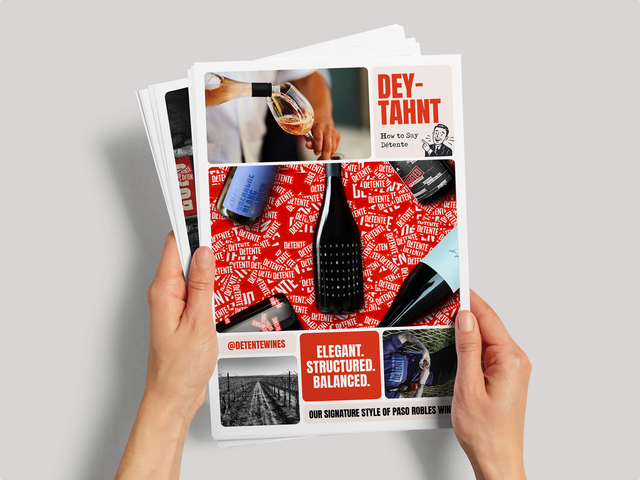
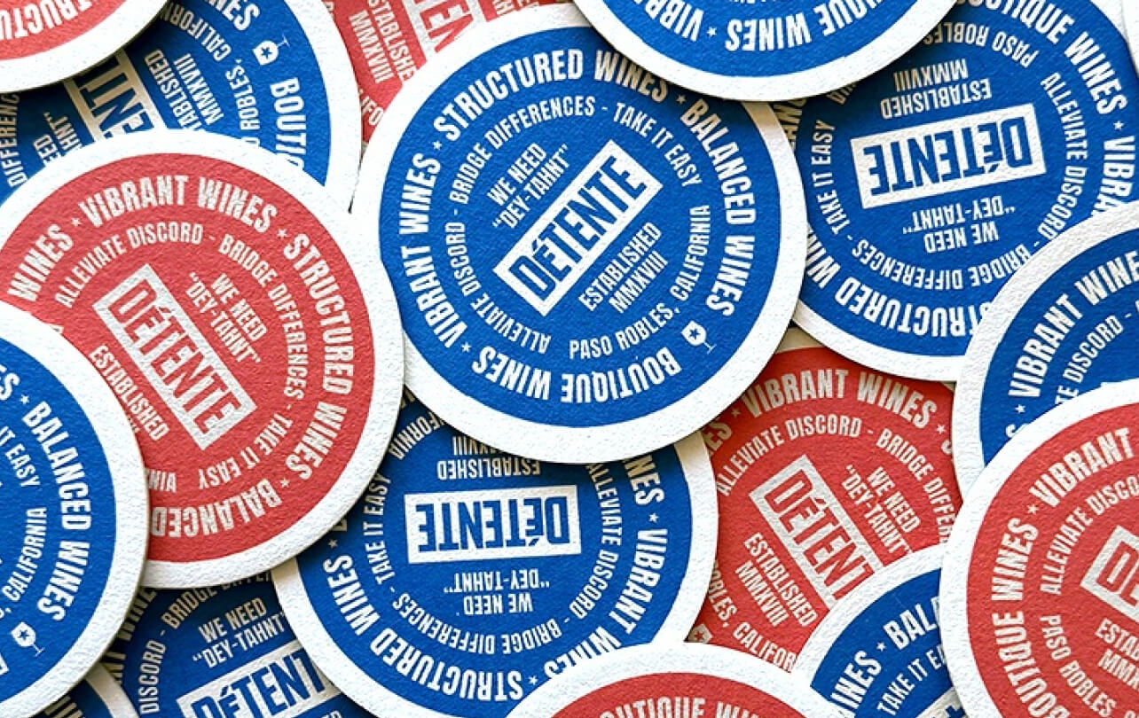
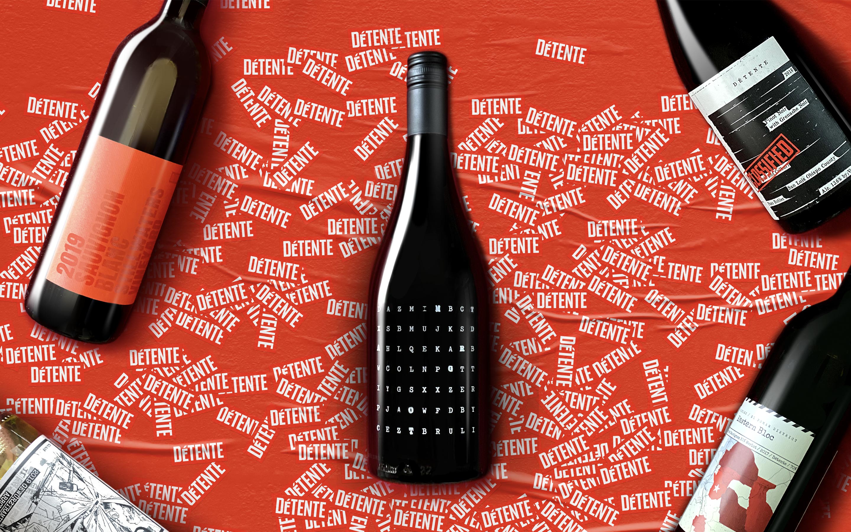
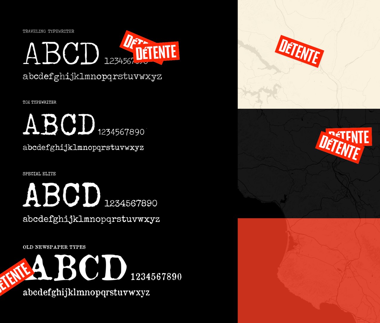
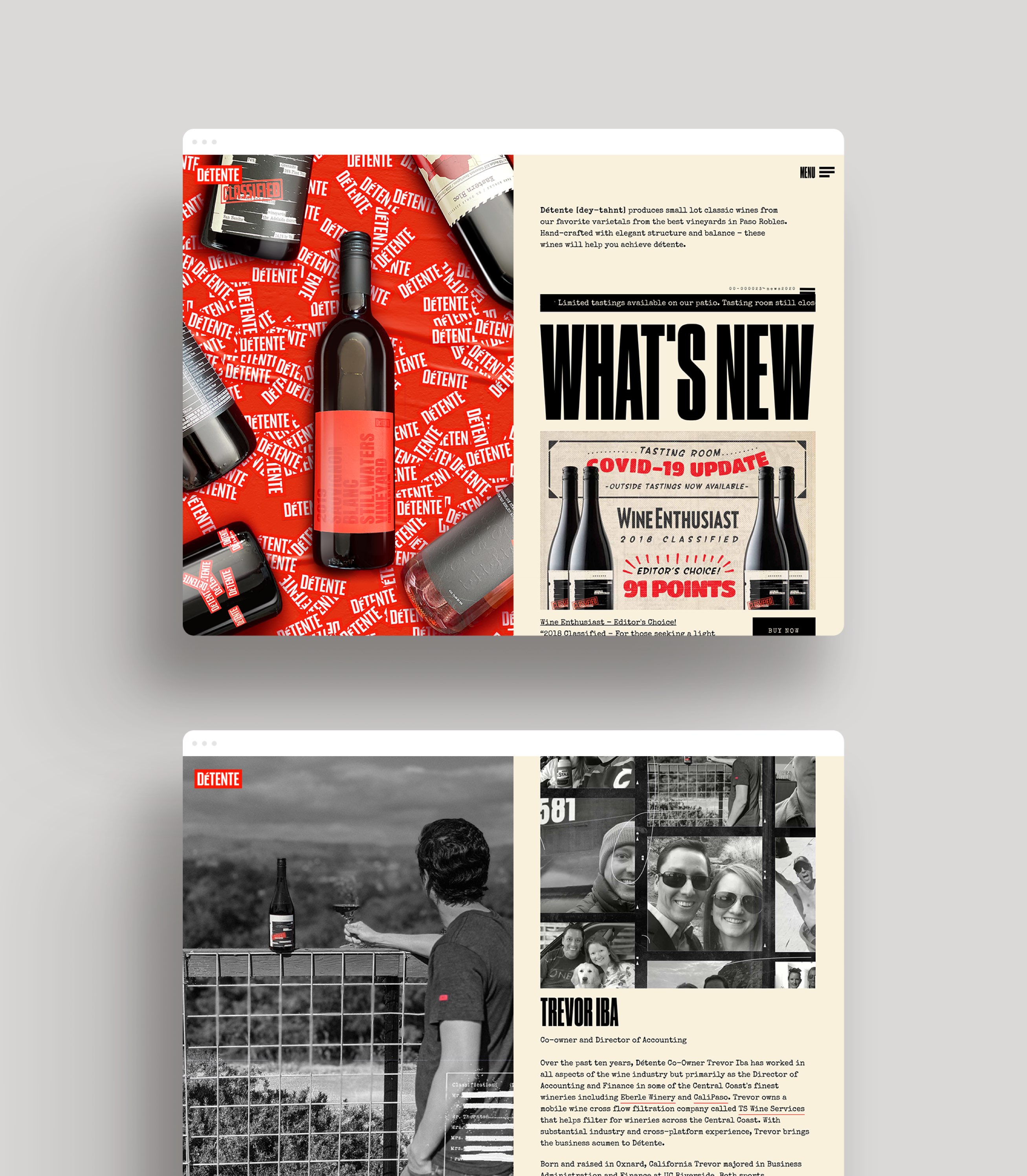
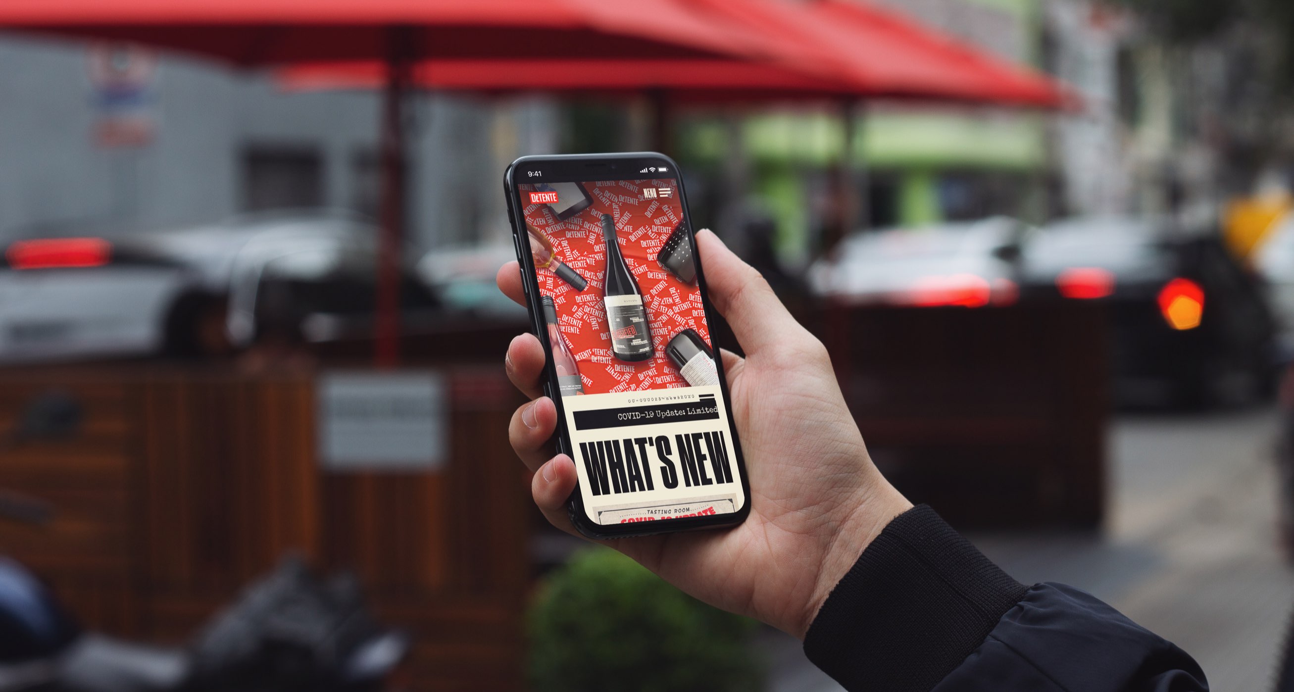
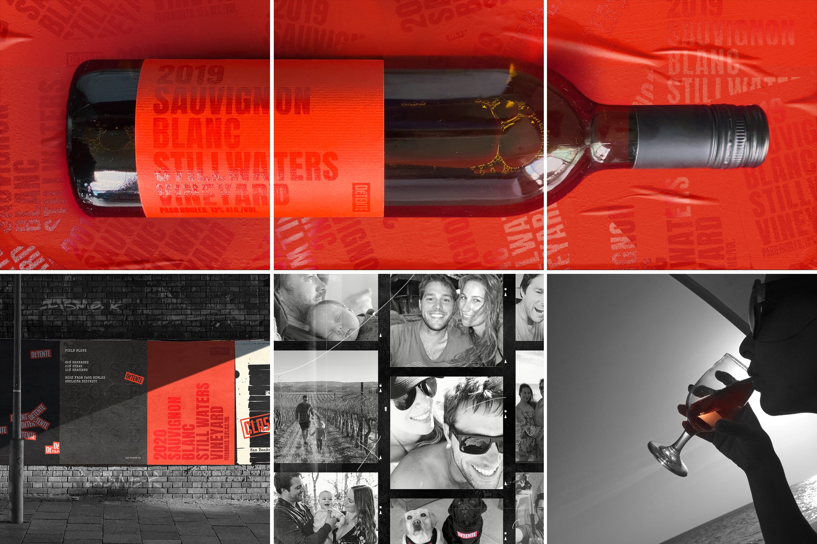
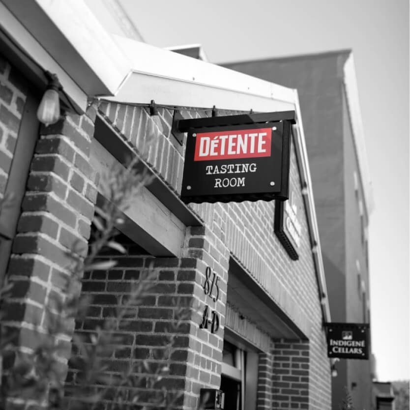
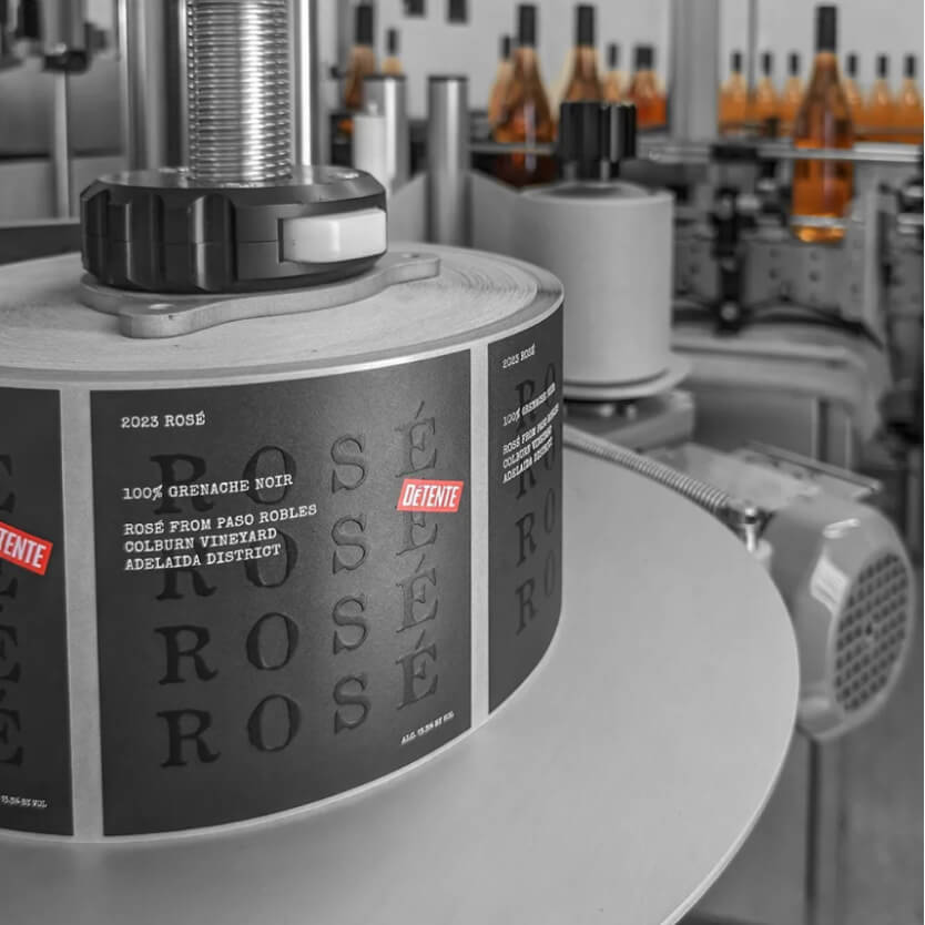
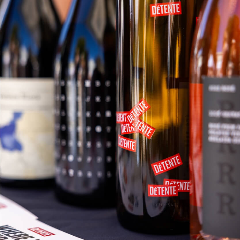
The word détente was coined during the Cold War to mean an easing of tension. The Détente logo plays on this theme through compact typography with intentionally tight padding, setting the tone for a dynamic push and pull. Used sparingly against white space, it eases tension. Overused, it amplifies it. That same sensibility carries through every label - each one designed with hidden meanings meant to be held, examined, and discussed. The personality of each Détente wine was matched to a distinct creative scenario rooted in secrecy, codes, and East versus West intrigue.
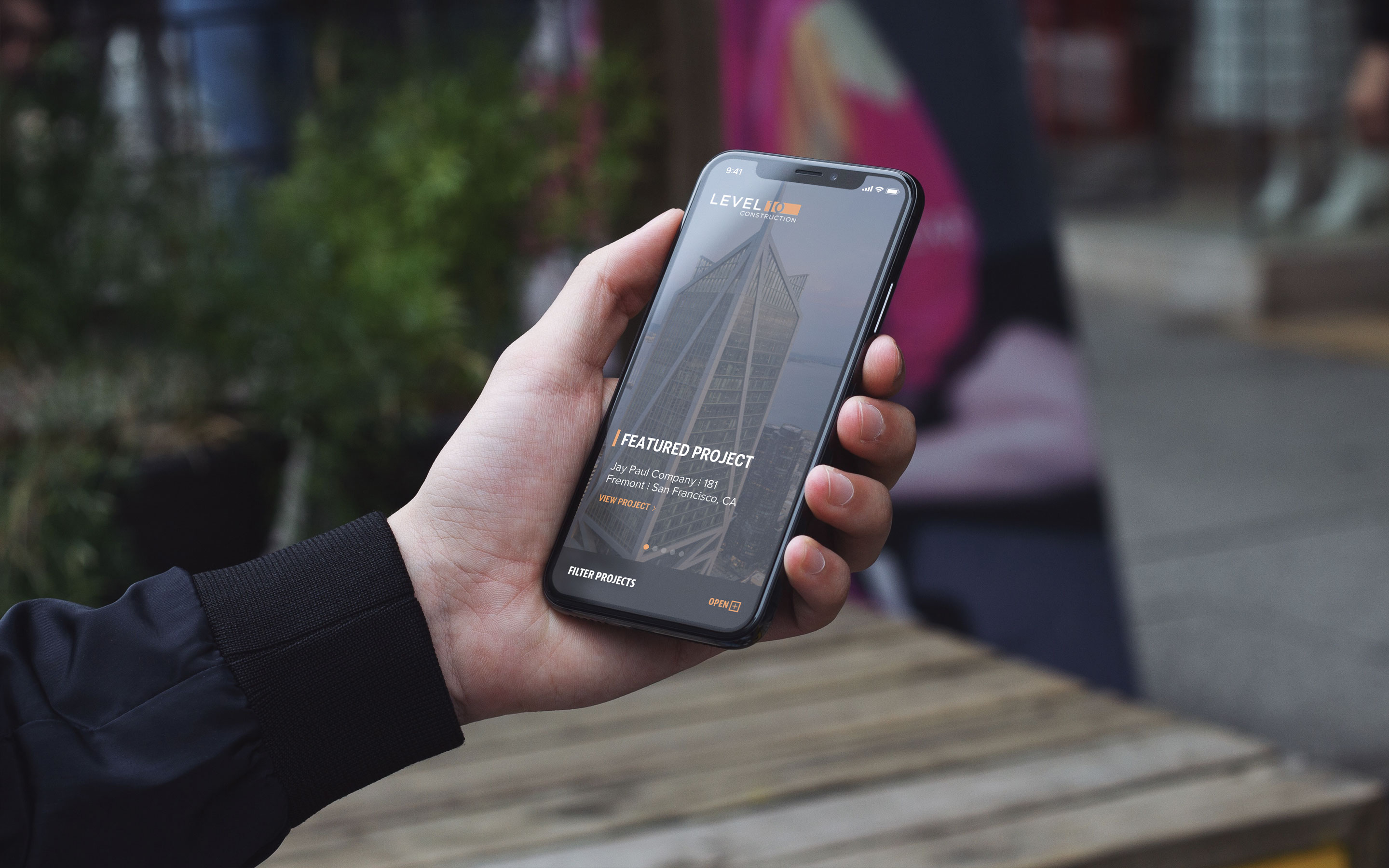
From there, the design system was built to scale. The website pairs digital signal interference and text scrambling with responsive typography in a minimal, high-impact, yet budget-conscious layout.

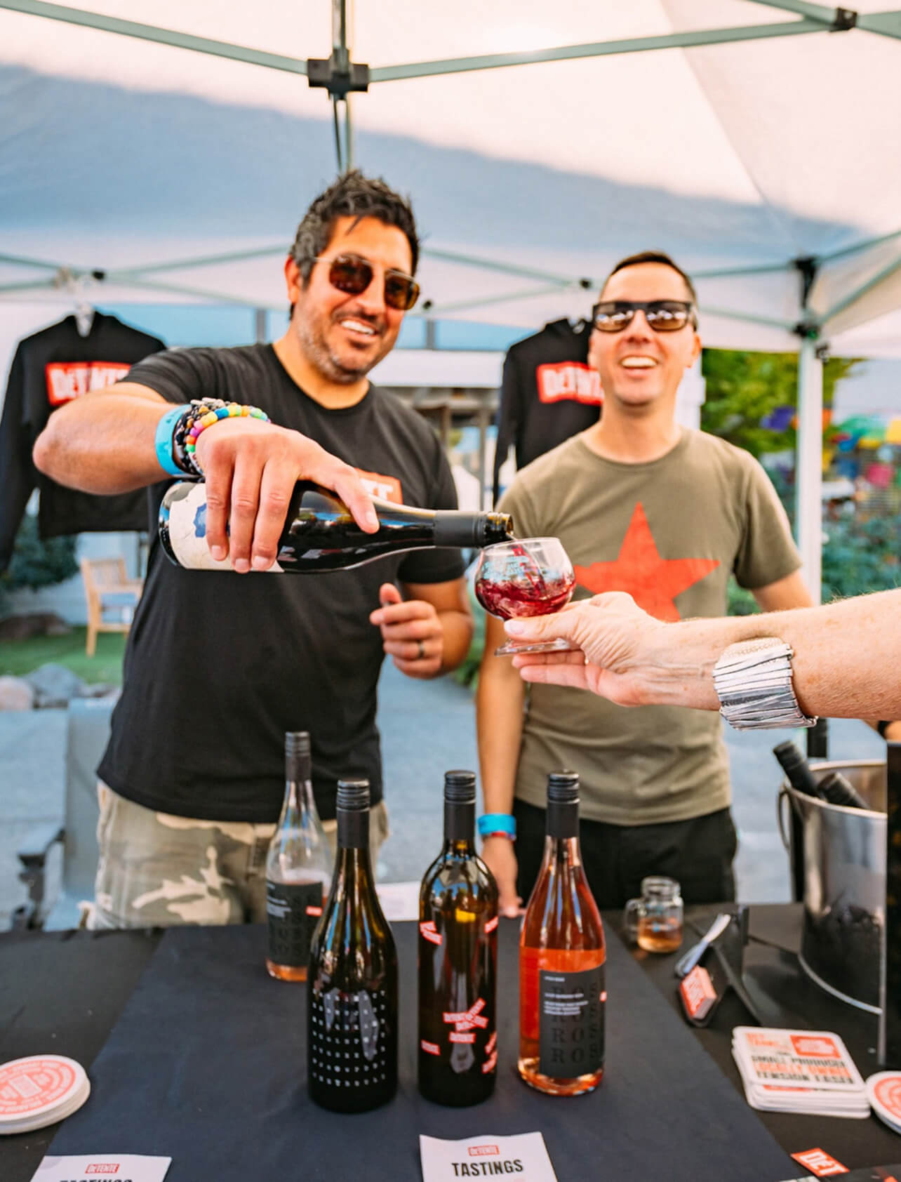
Making noise, standing out, and launching a brand on social media…anonymously.
It's not easy to be disruptive in the wine space when you can't tout who the winemaker is or share their accolades. Breaking through the wine industry’s traditional and expected content requires a lot of creative problem solving.
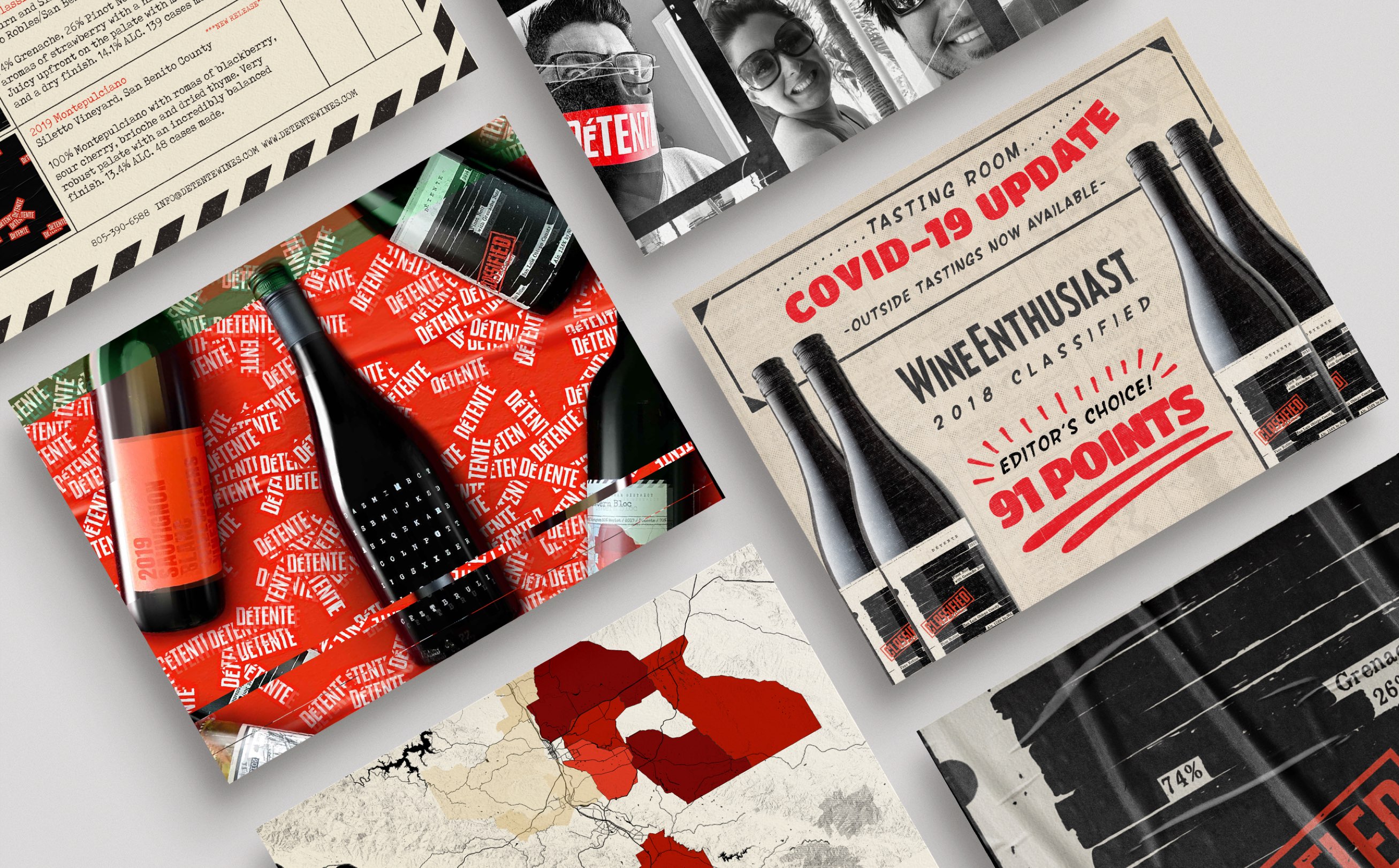
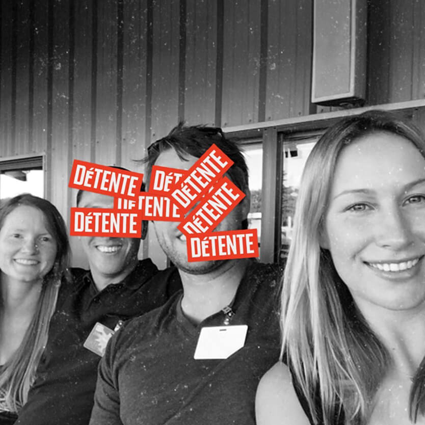
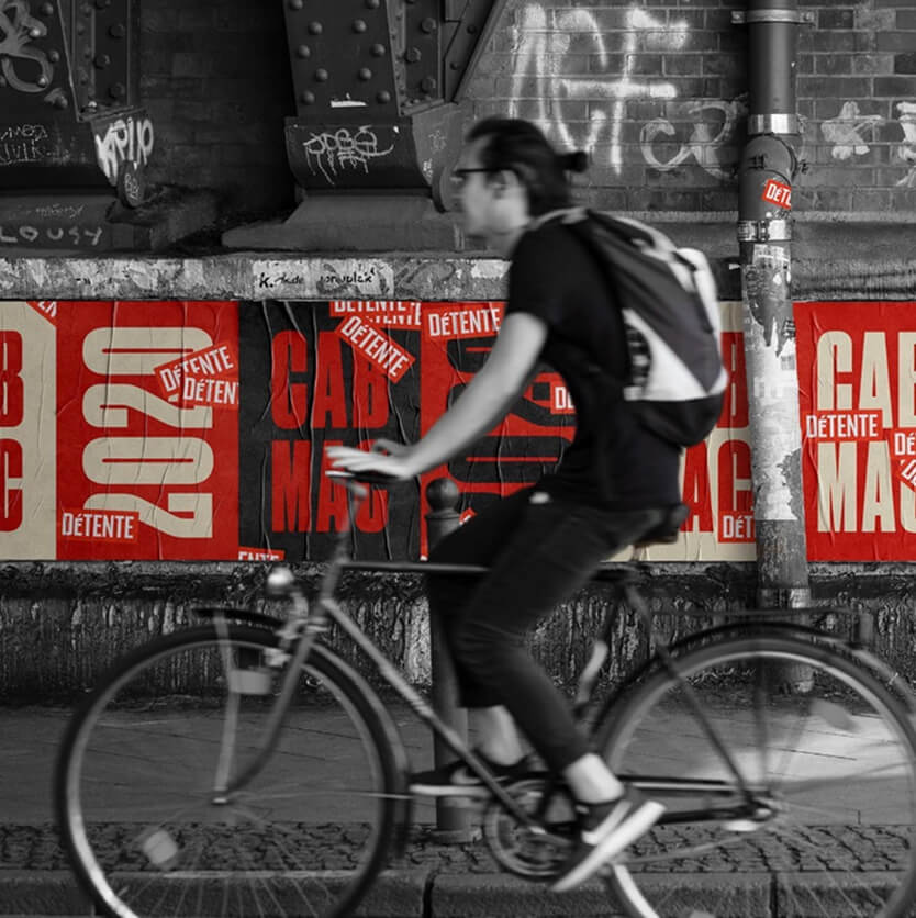
NK brought the world of Détente to life through black and white photography and spot color treatments to differentiate content. Strategic logo overuse masked the partners' identities, adding to the brand's propaganda effect. The defined photography style balanced traditional winery content with Détente's distinct tone and attitude. All of it was driven by a limited color palette and a guerrilla marketing mindset, tailored to a youthful, approachable brand.


As the brand evolved, so did the marketing collateral.
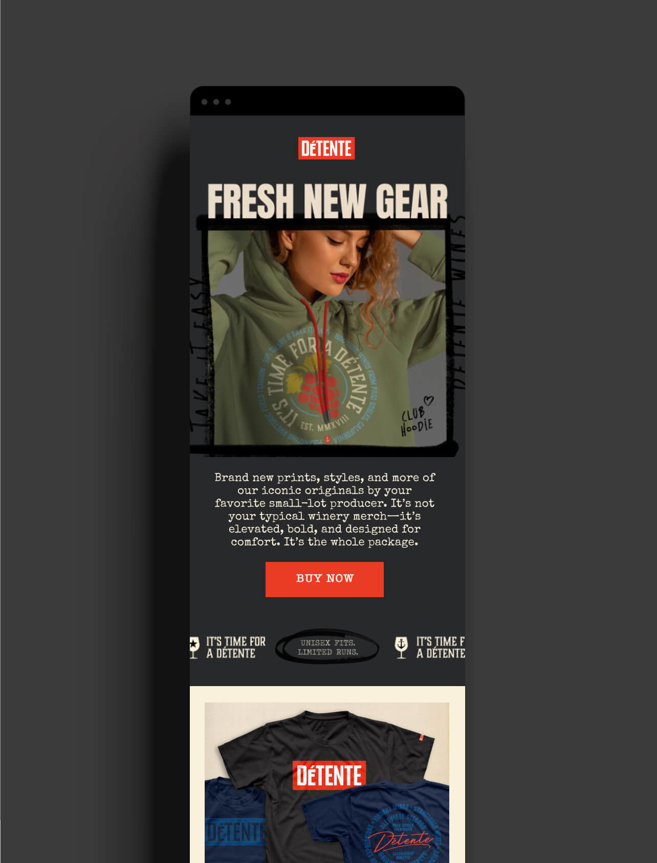
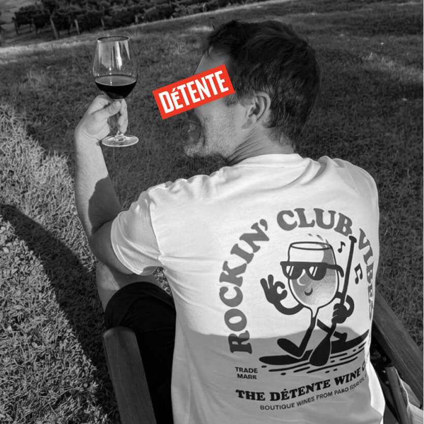
As Détente grew a modest following and club membership, more events and wholesale distribution created a desire to share the full story about just how small and boutique this local label truly was. NK extended the brand into newsletters, bar coasters, and an array of apparel; each piece as distinctive as the wines themselves.
Worth noting, Détente launched just months before the pandemic and has since weathered a period of intense political polarization and a dramatic reshaping of public discourse. If anything, the timing brings real weight to the word détente. The creative strategy embraced the bold art of hyperbole and the theatrical flair of propaganda to stir curiosity, spark devotion, and seduce the palate. Through playful exaggeration and persuasive charm, Détente crafted a narrative that is irresistibly dramatic. It’s not just wine. It's liquid diplomacy, poured with purpose, and served with swagger.